
Why everything looks the same and how to recover what really matters
Saturday morning. The sun is out and I'm walking through the centre of Barcelona. Well, not walking — dodging. Wave after wave of tourists; this is Barcelona's real sea. Strolling through the centre isn't a plan, it's an expedition. A safari. Locals venture down there less and less. And yet there's something magnetic about it… if you know where to move. Sometimes it's a light, a scent, or a design detail that changes everything.
I notice a new café. They only do takeaway coffee. You can see the different types of coffee from outside, a large plant by the entrance, lo-fi music drifting out from inside. There's a bench in case you want to stay, and the barista is wearing a cap — could be called Stefano, Jass, or Marta.
Can you picture it? Probably yes. And probably not the same one I saw. Because this café could be any café. I fed that very description into a prompt and Gemini gave me this:
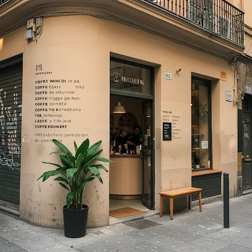
And yes… that's exactly what most new cafés in Barcelona look like. The same happens with taverns sporting a "traditional" aesthetic, Airbnb interiors, or brunch bars. Everything is pretty. Everything has "aesthetic coherence". But… why does everything look the same?
The aesthetic era
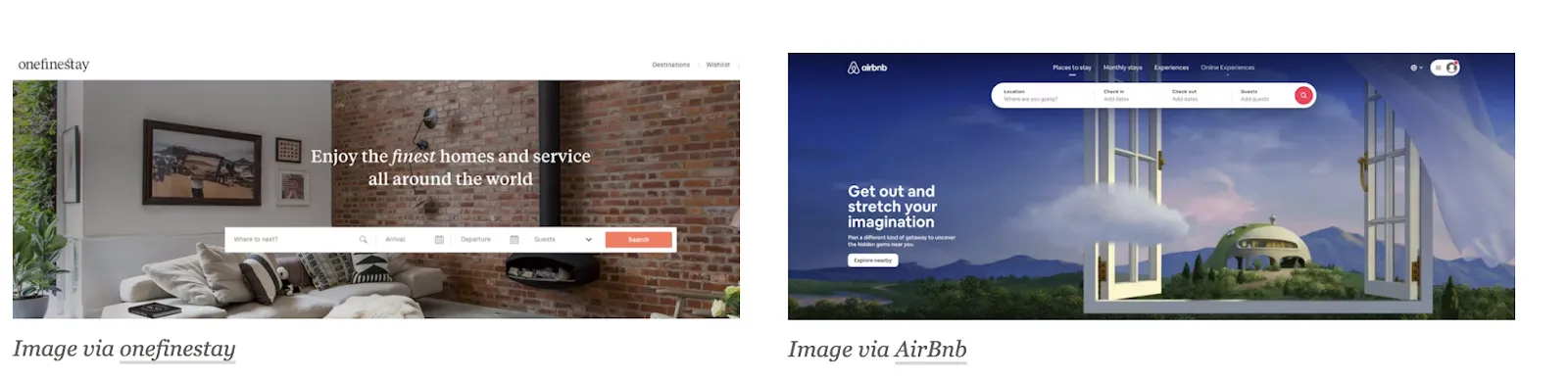
Just as with cafés, the same is happening in digital environments: rounded buttons, sans-serif typefaces, soft stock or generative imagery. In a quick scroll… is that a fintech or a health app? Is it an online university or a bank?
Journalist Caitlin Dewey noted in an article a study by Indiana University that analysed more than 10,000 websites and found that, since 2010, they have been growing increasingly similar. The same is happening with logos, illustrations, interiors, and cars. Alex Murrell summed it up perfectly in his visual essay "The Age of Average":
This phenomenon has a name: aesthetic consolidation. A wave of uniformity has swept through digital and visual design. And it's not that creativity is lacking… it's that the system rewards the repeatable. And in that, we lose something crucial: purpose.
Templates first
The paradox: today technology allows us to design almost anything. And yet, many websites look like a box inside another box. WordPress, Webflow, and Shopify have democratised the web. And that's great. But they've also standardised the experience: templates, reusable blocks, predictable layouts. Designing becomes a matter of choosing a template, not solving a problem. The result: correct, functional sites… but soulless. And bear in mind: templates are fine when understood as rules for combining elements — they don't replace strategic thinking or brand vision.
Speed level: core
Visual trends don't last long. Today it's "brutalist", tomorrow it's "claymorphism", the day after "Y2K-chic". Social media accelerates everything, but also burns it out faster.
In the context of TikTok, "core" refers to a new aesthetic or micro-trend that goes viral quickly, often defined by a specific style, ideals, beliefs, or values. And this has a huge influence! Every week a new visual "core" appears. Cottagecore, Clean Girl, Normcore… And although it might seem like this is just fashion or aesthetics, in reality these are ways of narrating ourselves and understanding the world (younger generations know this, but brands don't always).
What cores are and why they have such an impact:
https://www.tiktok.com/@florianamil/video/7306893493878705414
The obsession with the visual
Sometimes, without realising it, we design more for portfolios than for people. Are we genuinely resolving real friction? Or are we just building pretty things that look like other pretty things? Without meaning to, we fall into total standardisation: the same libraries, the same microinteractions. And although these tools help us enormously, they can also push us to design on autopilot.
What do we lose when everything looks the same?
-
Identity: In the era of "blanding" (that minimalist tendency which dilutes brand personality in pursuit of appearing "cleaner"), many companies are abandoning what made them unique. They do it out of fear of looking "dated", or a desire to appear more tech-forward, or simply by following what works for others. The problem is that, in trying not to fail, they also stop standing out.
-
Emotional connection: The generic doesn't move people (as much). You can have the cleanest design, the best UX, and a perfect visual system… and still say absolutely nothing. You know the "less is more" idea? Yes! A design can be simple and effective, absolutely — but we must try not to confuse simplicity with superficiality. The intention of design is to tell us something.
-
Time: When a design is inherited without reflection (when someone steps in and finds a prefabricated structure that doesn't quite fit what needs to be communicated), the patching begins. Text that doesn't fit gets forced in, sections get stretched, the same things get redone over and over. And so what seemed "quick and cheap" ends up costing a great deal.
-
Diversity and representation: When everything looks the same, there's a risk that everything thinks the same. Visual decisions are not neutral: they reflect a particular way of seeing the world. And the more that view is repeated, the more others are left out. This doesn't only affect brand identity — it also affects accessibility. Designing solely from a visual standpoint excludes those who navigate differently, whether due to a visual, motor, or cognitive impairment. If you're interested in the topic, read the article by my colleague Diana 😉
So, how do we return to designing with purpose?
It's not about reinventing the wheel every time, or doing something "never seen before" just to stand out. There are things that already work — usability standards that are sound. What I mean is recovering meaning: understanding that design doesn't start on the screen, but much earlier — in conversation, in observation, in strategy. Designing with purpose means committing to the real problem, to the user experience, and to brand coherence. It's about asking not only how it looks****, but why this way and for whom****.
1. Reclaiming the right to find inspiration
Inspiration shouldn't be a luxury — it should be part of the work. Making space to look, to have conversations, and to think differently should be part of the process. Being able to "step outside your feed". Creating space for inspiration is a way of resisting autopilot.
2. Design starts with strategy, not aesthetics
Design doesn't begin when we open Figma. Skipping strategy is like decorating a house without knowing who's going to live in it. And yet it happens constantly. The most memorable brands differentiate themselves not only through their appearance, but through how that appearance tells a story that's coherent with who they are.
3. Investing in research
If we don't observe, ask questions, and test, what we'll end up doing is designing from assumptions, not from certainties. Research doesn't have to be a six-month study. Sometimes it's enough to listen to a conversation, run a test, or review data we already have. The key is to design from the user's reality, not from what we think they need. Research means understanding — not confirming what we already thought.
4. Designing systems, not screens
A pretty screen might work today, but what about tomorrow? What about when the product needs to scale, or be maintained by a different team? Designing systems means thinking about the whole: how the design behaves, how it grows, how it adapts to new needs without breaking. It's more about thinking in patterns, hierarchies, and clear rules that align the whole team. Good design is not what shines in a presentation, but what holds up and evolves well day to day.
5. Understanding design as culture, not as deliverable
When design is seen only as something the design team produces, its real value is lost. Purposeful design is a way of thinking, of making decisions, of solving problems collaboratively. It filters through into how we prioritise, how we write, how we understand the impact of what we do. When design is part of organisational culture, it stops being "a project phase" and becomes a way of moving forward with intent.
Spoiler: the one thing you can't copy is purpose
In a world where everything looks alike, what truly connects, differentiates, and endures is not aesthetics… it's intention. Trends, frameworks, and templates are all valid and valuable tools, but none of them can define who you are as a brand. Only a clear strategy, a critical perspective, and a design that has something to say can do that. That is the real act of disruption.